Colour psychology plays a powerful role in kitchen design, influencing not only how a space looks but also how people feel, eat, and interact within it. Since the kitchen is often the heart of the home, choosing the right colour palette can directly impact mood, appetite, energy levels, and even social behaviour.
In this guide, we’ll explore how colour psychology affects kitchen design, which colours stimulate appetite or calm the mind, and how to choose the best kitchen colours based on lifestyle, lighting, and design goals.
Whether you’re renovating a kitchen, designing a new home, or working with clients, understanding colour psychology can help you create a kitchen that is both beautiful and functional.
Why Colour Psychology Matters in Kitchen Design
Colour psychology is the study of how colours influence human emotions and behaviour. In kitchen design, colour impacts:
-
Appetite and eating habits
-
Emotional comfort and stress levels
-
Perceived cleanliness and warmth
-
Social interaction and energy
-
Spatial perception (large vs small kitchens)
Unlike bedrooms or offices, kitchens are high-stimulus environments. People cook, eat, talk, and move quickly, making colour choice especially critical.
How Colours Influence Appetite and Mood
Different colours trigger different psychological and physiological responses. Some stimulate hunger, while others suppress appetite or promote relaxation.
Understanding these responses allows designers and homeowners to intentionally shape behaviour through colour.
Warm Colours in Kitchen Design
Warm colours are associated with energy, comfort, and stimulation. They are often used in kitchens to encourage appetite and social interaction.
Red: Appetite Stimulation and Energy
Red is one of the most powerful appetite-stimulating colours. It increases heart rate and energy levels, making it popular in restaurants and fast-food branding.
Best uses of red in kitchens:
-
Accent walls
-
Backsplashes
-
Bar stools or decor elements
Avoid:
Overusing red in small kitchens, as it can feel overwhelming or aggressive.
Best for:
-
Social kitchens
-
Entertaining spaces
-
Bold, modern designs
Orange: Warmth and Sociability
Orange combines the energy of red with the happiness of yellow. It promotes conversation and warmth without being as intense as red.
Psychological effects:
-
Encourages appetite
-
Creates a friendly atmosphere
-
Feels energetic yet welcoming
Design tips:
-
Use terracotta or muted orange tones for a sophisticated look
-
Works well with wood finishes and neutral countertops
Yellow: Optimism and Light
Yellow is associated with happiness, sunshine, and positivity. In kitchens, it can make spaces feel brighter and more open.
Benefits of yellow kitchens:
-
Enhances mood
-
Works well in low-light spaces
-
Creates a cheerful environment
Caution:
Bright or neon yellow can cause visual fatigue. Opt for soft butter yellow or muted mustard tones.
Cool Colours in Kitchen Design
Cool colours tend to calm the mind and reduce appetite. They are ideal for modern, minimalist, or health-focused kitchens.
Blue: Calm but Appetite-Suppressing
Blue is known for its calming and stress-reducing qualities. However, it naturally suppresses appetite because blue foods are rare in nature.
Best uses:
-
Cabinets
-
Kitchen islands
-
Coastal or modern kitchens
Avoid:
Using dark blue in small kitchens without sufficient lighting.
Ideal for:
-
Mindful eating
-
Sleek, contemporary homes
Green: Balance and Freshness
Green represents nature, balance, and health. It is one of the most versatile colours for kitchen design.
Why green works well in kitchens:
-
Promotes calm and wellbeing
-
Supports healthy eating habits
-
Pairs beautifully with wood, marble, and brass
Popular green kitchen shades:
-
Sage green
-
Olive green
-
Forest green
Green kitchens feel grounded and timeless, making them a strong long-term choice.
Neutral Colours in Kitchen Design
Neutral colours provide flexibility, longevity, and broad appeal. They are especially popular in modern and resale-focused homes.
White: Clean, Bright, and Timeless
White kitchens are classic and versatile.
Advantages:
-
Makes kitchens feel larger
-
Reflects light effectively
-
Suggests cleanliness and simplicity
Downside:
All-white kitchens can feel sterile without texture or contrast.
Tip:
Layer white with warm wood, stone, or metal finishes.
Grey: Modern and Sophisticated
Grey kitchens are elegant and contemporary, offering a neutral backdrop that pairs well with bold accents.
Best grey tones:
-
Warm grey (greige)
-
Light concrete grey
Avoid overly cool greys in kitchens lacking natural light.
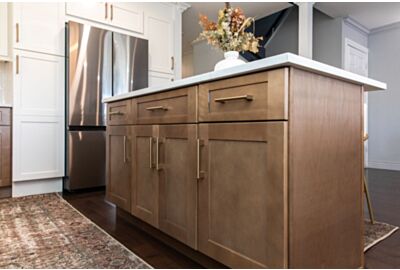
Beige and Earth Tones: Warmth and Comfort
Beige, taupe, and sand tones bring warmth and understated elegance.
Ideal for:
-
Traditional kitchens
-
Mediterranean or rustic styles
-
Homes seeking warmth without bold colour
How Kitchen Colour Affects Eating Habits
Research shows colour can influence how much we eat and how fast.
-
Warm colours → increase appetite and eating speed
-
Cool colours → slow eating and reduce hunger
-
Neutral colours → emotionally stable eating environment
This is why restaurants often use red and orange, while wellness-focused homes lean toward green and blue.
Choosing Kitchen Colours Based on Lifestyle
For Families
-
Warm neutrals with colour accents
-
Durable finishes
-
Cheerful but not overwhelming tones
For Health-Conscious Homeowners
-
Green or blue palettes
-
Natural materials
-
Soft lighting
For Entertainers
-
Red, orange, or deep green accents
-
Statement islands
-
Layered lighting
For Small Kitchens
-
Light colours
-
Reflective surfaces
-
Minimal contrast
The Role of Lighting in Colour Psychology
Lighting dramatically affects how colour is perceived.
-
Natural light enhances cool tones
-
Warm lighting softens whites and neutrals
-
LED temperature can shift mood significantly
Always test colour samples under actual kitchen lighting conditions before final decisions.
Common Kitchen Colour Mistakes to Avoid
-
Choosing colour without considering lighting
-
Overusing bold colours
-
Ignoring backsplash and countertop interaction
-
Designing for trends only
A balanced palette always outperforms extreme choices.
If you’re planning a kitchen renovation or designing for clients, a thoughtful colour strategy can make all the difference. Feel free to reach out for expert kitchen design guidance tailored to your space and goals.